BUSINESS LOAN


OVERVIEW

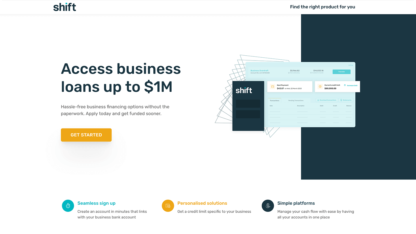
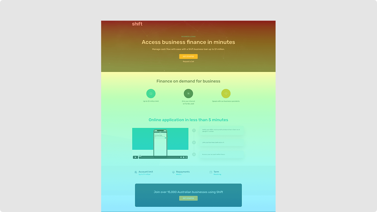
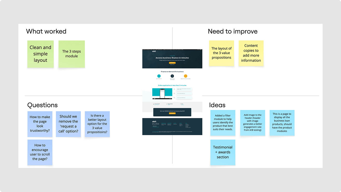
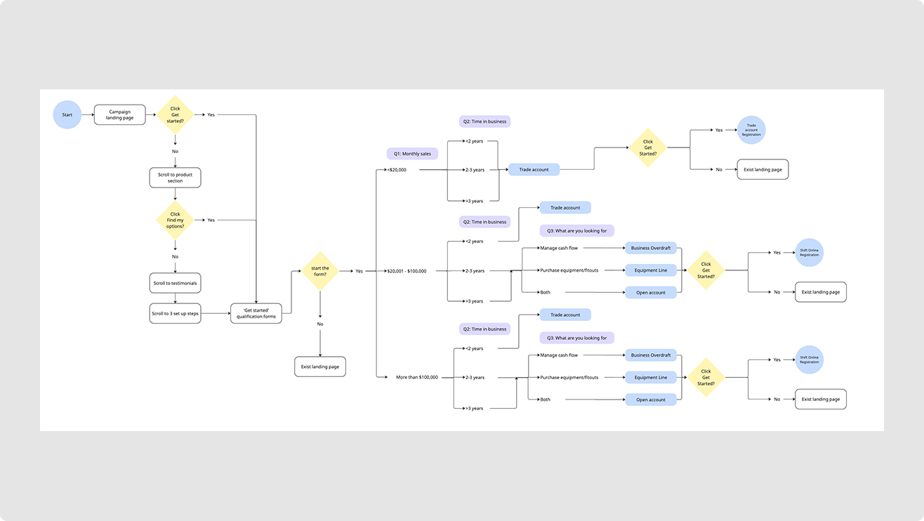
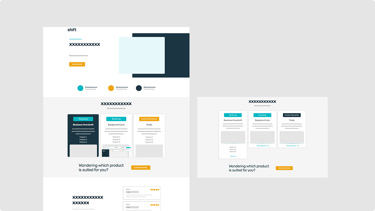
This project focused on redesigning the ad landing page to improve user engagement and content retention. The goal was to encourage visitors to explore the full page, better understand the products, and help filter qualified leads more effectively.

ROLE

Digital designer

DATE

2023

OUTCOME

23%

MODULE
INTERACTION RATE

OUTCOME

+28%

INCREASED SCROLL
COMPLETION RATE

businessloan hero

RESEARCH

UNDERSTAND USER BEHAVIOR

Analyzed heatmaps of exisiting landing page to gain insights into user behavior and scrolling patterns.

  • Only 27% of users scrolled to the bottom of the page, indicating low engagement with lower sections.
  • Users attempted to click on the value proposition icons due to the large, coloured circles, which gave the impression they were interactive.
  • A/B tested CTA colours and header with/without image.
businessloan-research

IDEATION

COLLABRATION

Brought stakeholders together to align on goals, explore improvement areas, and uncover opportunities for enhancing the landing page experience.

USER EXPERIENCE

USER FLOW MAP

Collaborated with the creative manager and marketing team to define the user flow diagram, then presented the concept to stakeholders for feedback and alignment — with a key focus on refining the user journey for the qualifier form.

businessloan-research

MID-FIDELITY DESIGN

WIREFRAMES

I developed wireframes to plan the page structure and user flow, then presented the concept to the stakeholders for feedback and alignment.

FINAL DESIGN

  • Added a header image to increase visual engagement and draw users into the page.
  • Reduced the size of icons to avoid confusion with CTAs and shift focus toward the value propositions.
  • Introduced a testimonial section with an award badge to build trust and credibility with users.
xbox-final

KEY FEATURES

PRODUCT INFO SECTION

  • Used concise, benefit-focused copy to introduce each product clearly.
  • Designed simplified screen mockups to visually demonstrate the product at a glance.
  • Implemented collapsible feature sections to keep the layout clean and scannable, while allowing users to explore details at their own pace.

KEY FEATURES

QUALIFIER FORM

  • Designed to help users self-serve and identify the product that best fits their needs.
  • Acts as a lead filter, surfacing more qualified prospects and reducing unqualified inquiries.
  • Kept the form short and conversational to reduce friction.
  • Adds a layer of interactivity to the page, improving user engagement and experience.